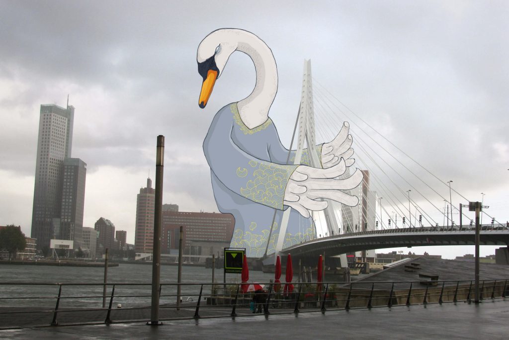
A series of unusual photos from different places around the world. I would like to let other people see through my playful goggles for a moment and enjoy my favourite places a little bit differently
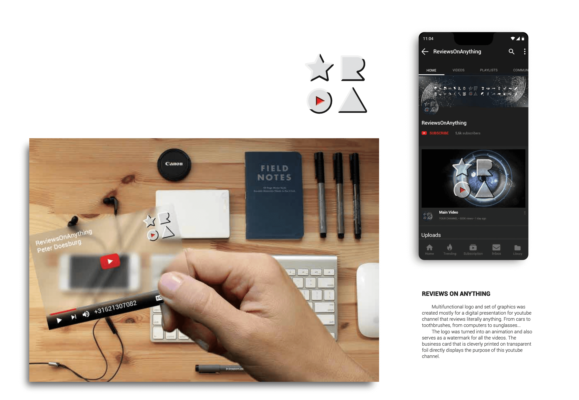
Multifunctional logo and set of graphics was created mostly for a digital presentation for youtube channel that reviews literally anything. From cars to toothbrushes, from computers to sunglasses… The logo was turned into an animation and also serves as a watermark for all the videos. The business card that is cleverly printed on transparent foil directly displays the purpose of this youtube channel.
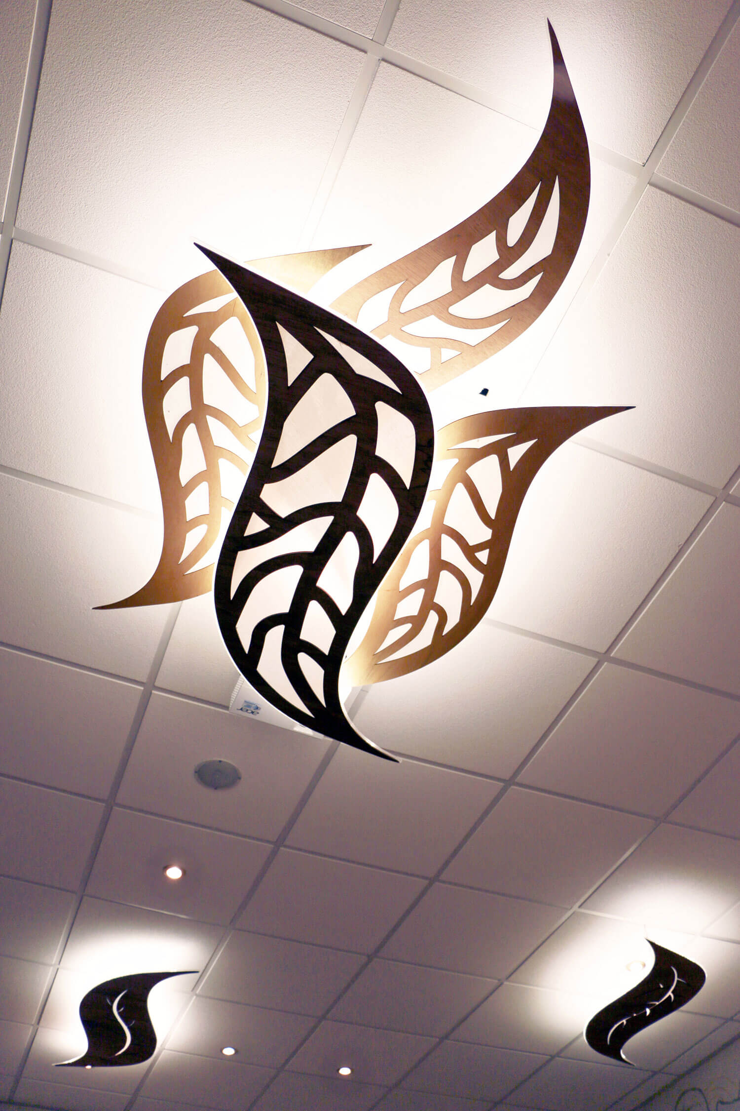
The Andersom logo is based on the graphic elements of the RealFood logo. It contains the same “R” hinting that this is only one of the restaurants from the whole organisation. Repeating the graphic shape of the leaf in the first letter A is linking the logotype even stronger to the whole design house style. The letter “E” was used backwards to hint a change and taking steps back to basic healthy food. My responsibility was to create a strong visual style that was applied in any possible promotional materials. From banners, leaflets and clothing to unique designed interior lights.
Tax and legal services for individuals, self-employed individuals and small businesses. Personal, comprehensive and to the point! Tom needed a strong visual identity that has many clever application possibilities. He works a lot with young and creative people and he understands them well so it was important to communicate it in the branding. Street style of the logo invites for friendly conversation. Yet the sharpness and the boldness of the lettering leaves no space for doubt about his capabilities. The business card is playing with the colours of the tax authorities. These soft colours that are associated with taxes are softly blended together to create an eye catching gradient background…
Zeybramag is an ambitious project to connect all humans around the world through stories and shared experience. The client’s request was to create a colourful and spiritual logo with a soul. The zebra with the wings guards us from above like an ancient godess, protecting our stories and offering a safe haven. A hand written font is inspired by creatures dancing around the fire.
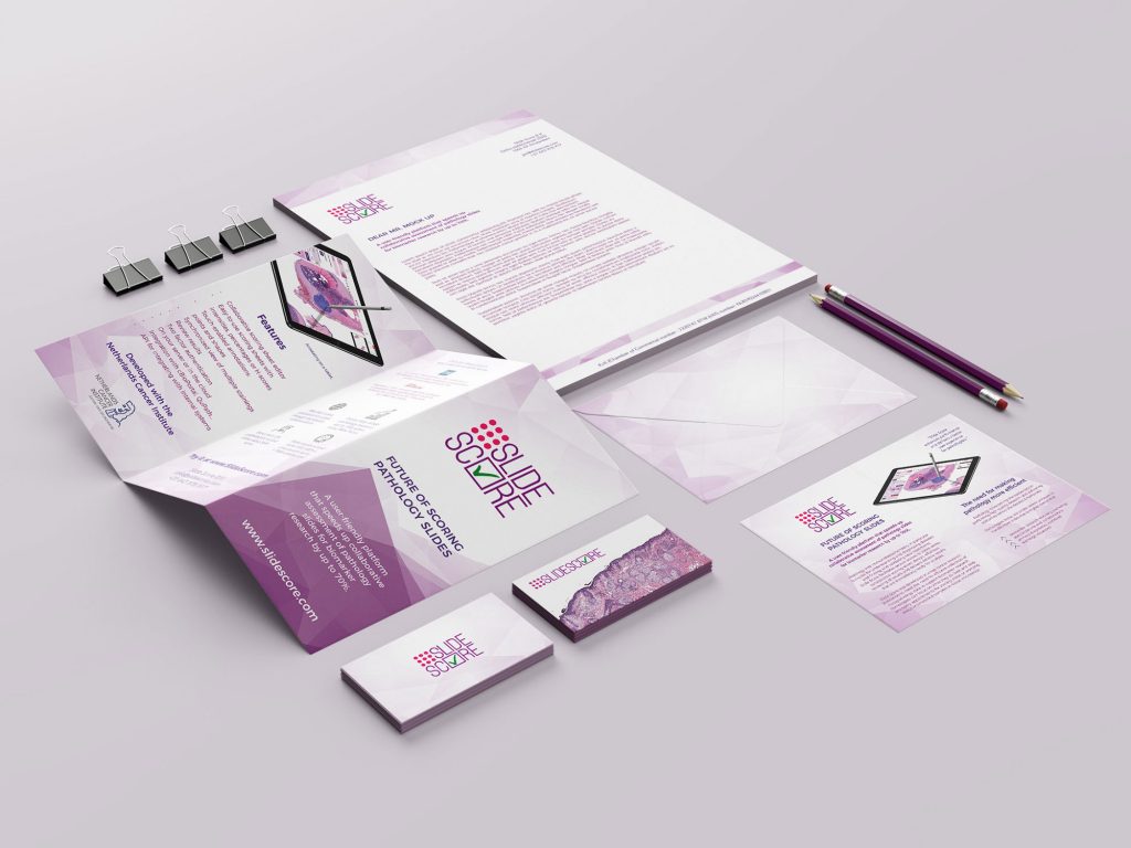
Slidescore is an app developped together with Netherlands cancer institute. I have designed the whole visual identity including the website and consulting the UX itself. It is crucial that the visual communication is straight forward and shows familiar colour pallete for pathologists. The logo playfully depicts the set up for scoring samples with a checkmark. I have built the colour pallete around the actual cell samples that are displayed in hues of pink and purple.
This website uses cookies to improve your experience. We'll assume you're ok with this, but you can opt-out if you wish. Cookie settingsACCEPT
Privacy & Cookies Policy
Privacy Overview
This website uses cookies to improve your experience while you navigate through the website. Out of these cookies, the cookies that are categorized as necessary are stored on your browser as they are essential for the working of basic functionalities of the website. We also use third-party cookies that help us analyze and understand how you use this website. These cookies will be stored in your browser only with your consent. You also have the option to opt-out of these cookies. But opting out of some of these cookies may have an effect on your browsing experience.
Necessary cookies are absolutely essential for the website to function properly. This category only includes cookies that ensures basic functionalities and security features of the website. These cookies do not store any personal information.
Any cookies that may not be particularly necessary for the website to function and is used specifically to collect user personal data via analytics, ads, other embedded contents are termed as non-necessary cookies. It is mandatory to procure user consent prior to running these cookies on your website.


