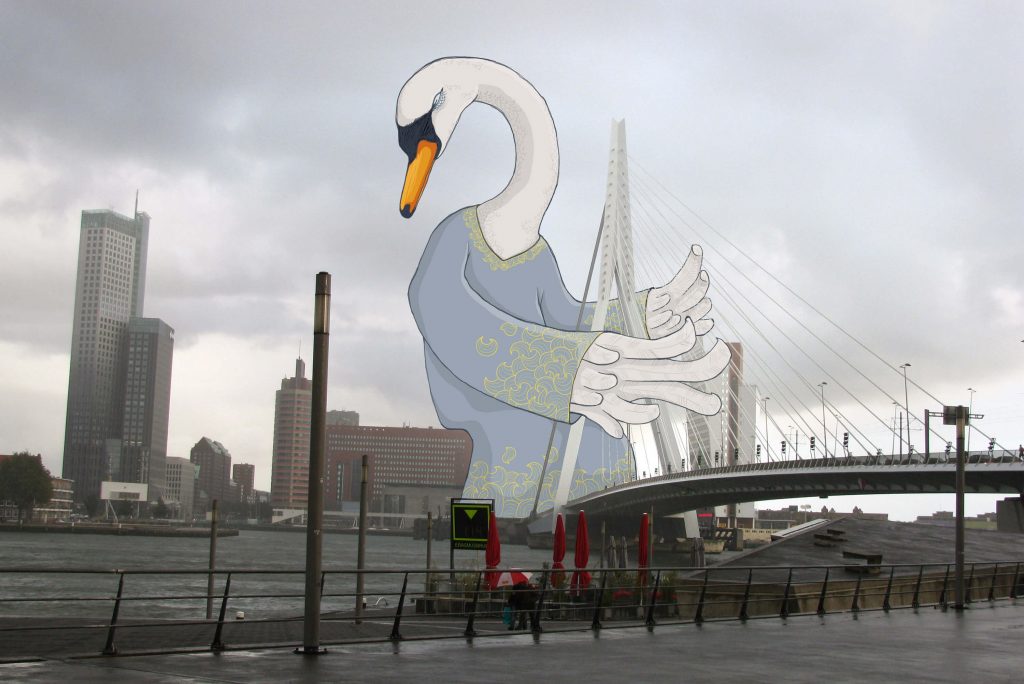
GREETINGS FROM…


GREETINGS FROM...
A series of unusual photos from different places around the world.
I would like to let other people see through my playful goggles for a moment and enjoy my favourite places a little bit differently


A series of unusual photos from different places around the world.
I would like to let other people see through my playful goggles for a moment and enjoy my favourite places a little bit differently

Multifunctional logo and set of graphics was created mostly for a digital presentation for youtube channel that reviews literally anything. From cars to toothbrushes, from computers to sunglasses…
The logo was turned into an animation and also serves as a watermark for all the videos. The business card that is cleverly printed on transparent foil directly displays the purpose of this youtube channel.
ROA Reviews On Anything Read More »

The Andersom logo is based on the graphic elements of the RealFood logo. It contains the same “R” hinting that this is only one of the restaurants from the whole organisation. Repeating the graphic shape of the leaf in the first letter A is linking the logotype even stronger to the whole design house style. The letter “E” was used backwards to hint a change and taking steps back to basic healthy food. My responsibility was to create a strong visual style that was applied in any possible promotional materials. From banners, leaflets and clothing to unique designed interior lights.


Book design, cover, layout and DTP.
ENICAR: TIME FOR A CHANGE Read More »
Utrecht University – Science park, Utrecht.
Ideablaster is a complex interactive machine placed in a meeting space of Centre for Unusual Collaborations, part of the alliance between Technical University Eindhoven, Wageningen University and Research, Utrecht University and University Medical Center Utrecht.
The machine consist of several parts that bring out playfullness and spark creativity. The installation includes thinking concepts like random words method, acronym creation, deus ex machina and an analog timer in the form of Galileo escape mechanism. All together this boosts the process of generating new and unusual ideas from the academic collaborations.
https://www.unusualcollaborations.com/cuco-news/blast-ideas-at-cuco
This interactive installation tells the story of a new innovative sustainable material. The world’s fist circular composite. As you turn the machine you can experience the movement towards a better world fighting the plastic pollution one bottle at the time…
You can see the time running out in the plastic bottles filled with flakes of raw material. With every use (turn) of Sustonable you flip the sand clock and gain some time. The powdered plastic and quartz are heated up to create a flexible paste. By cooling down the new composite is born. You can see this process on the right bottom gears. Sustonable can be moulded or cut in any shape or color. It’s all up to your imagination! Sustonable is 100% recyclable closing its circle of life and leaving no trace.


Tax and legal services for individuals, self-employed individuals and small businesses. Personal, comprehensive and to the point! Tom needed a strong visual identity that has many clever application possibilities. He works a lot with young and creative people and he understands them well so it was important to communicate it in the branding. Street style of the logo invites for friendly conversation. Yet the sharpness and the boldness of the lettering leaves no space for doubt about his capabilities. The business card is playing with the colours of the tax authorities. These soft colours that are associated with taxes are softly blended together to create an eye catching gradient background…
DEBETS VISUAL IDENTITY Read More »


Zeybramag is an ambitious project to connect all humans around the world through stories and shared experience. The client’s request was to create a colourful and spiritual logo with a soul.
The zebra with the wings guards us from above like an ancient godess, protecting our stories and offering a safe haven.
A hand written font is inspired by creatures
dancing around the fire.


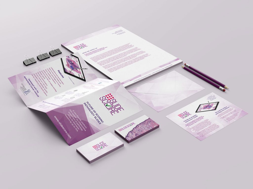
Slidescore is an app developped together with Netherlands cancer institute. I have designed the whole visual identity including the website and consulting the UX itself. It is crucial that the visual communication is straight forward and shows familiar colour pallete for pathologists. The logo playfully depicts the set up for scoring samples with a checkmark. I have built the colour pallete around the actual cell samples that are displayed in hues of pink and purple.
SLIDESCORE VISUAL IDENTITY Read More »


